Brand Standards
Volume I · July 2026

A working guide to the Escarra identity. Marks, color, type, imagery and voice, and the rules that hold them together.

The House

Escarra is a Brooklyn-based supplier of luxury bed and bath textiles for independent and boutique hotels. Robes, towels, linens and slippers, made with the care of an established estate.

Three tiers of one standard: Signature, Luxe and Reserve. Sold to hotels, offered as private label, and shipped direct. Quiet, honest, made to last.

Quiet, honest, made to last.
Three tiers of one standardSignature · Luxe · Reserve
Three channelsHotels · Private Label · Direct
The houseBrooklyn · Est. 2020
Contents

The Standards

01 · Ten marks, one family

The Marks

The primary lockup leads. The monogram badge is reserved for packaging, labels and woven tags. The hare stands alone at small sizes, in pattern and in embroidery. Every mark is supplied artwork. It is never redrawn and never approximated. Below, the family at relative scale, in True Black on Stark White.

Core Marks
Primary Lockup
01Primary LockupWeb, print headers, signage.
Formal Lockup
02Formal LockupCovers, certificates, formal print.
Primary Wordmark
03Primary WordmarkText only, where a badge sits elsewhere.
E Monogram
04E MonogramEveryday product, labels, tags.
Hare Large
05Hare LargeStandalone device, embroidery, pattern.
Hare Small
06Hare SmallBelow 100px, and in tight corners.
Secondary Marks
Wordmark with Established Year
07Wordmark with Est. YearHeritage settings and colophons.
Classic Badge Full
08Classic Badge FullApparel and merchandise. Print only.
Classic Badge Mini
09Classic Badge MiniApparel and merchandise, small.
Framed E Monogram
10Framed E MonogramHeritage mark for labels and presentation.
Escarra favicon monogram
The Favicon The one mark that ships in a fixed color: white on Claret. Use it for the browser tab and app icon only, at 16px and never above 32px.
Min 16px · Max 32px
The pairing room

Set any mark on any approved ground. The mark takes the ink with the strongest contrast. There are four pairings and no others.

Mark
Ground
Minimum size · 120px wide Marks always run at full strength, never on a 40 or 20 percent tint.
Vector files of every mark, in any approved pairing, are on the Resources page.
Construction · scale · misuse

Usage

Give the marks room and leave them alone. Clear space, minimum sizes, and the handful of things we never do.

Construction and clear spaceX is the cap height of ESCARRA. Clear space is 1X on every side, and the zone stays empty. Y is the height of the subtext, and the gap between wordmark and subtext is 1Y. Both units scale with the mark.
X
X
X
X
X
Y
Y
Legibility scaleEach mark shown at its smallest permitted size, actual scale. Below these sizes, step to the simpler mark.
Formal Lockup160 px · 40 mm print
Primary Lockup120 px · 30 mm print
Wordmark with Est. Year120 px · 30 mm print
Primary Wordmark64 px · 12 mm print
Classic Badge Full120 px · 20 mm · print only
Hare Large100 px · 20 mm print
Monogram Badge64 px · 10 mm print
Hare Small48 px · 8 mm print
Classic Badge Mini48 px · 8 mm print
Favicon16 px · favicon only · Claret
Marks shown in True Black on Linen Stone. The favicon is the one exception and ships white on Claret.
Clear space1X on every side, where X is the cap height of ESCARRA. It scales with the mark.
Lockup gapInside a lockup, the gap between wordmark and subtext is 1Y, where Y is the subtext height.
Below minimumWhen space runs short, step down to a simpler mark: the wordmark below 120px, the small hare below 100px.
On productThe Monogram Badge or the hare, chosen by the person ordering the piece. The Classic Badges are reserved for apparel and merchandise.
Misuse · six things we never do
✕Do not stretch or condense
✕Do not recolor outside the palette
✕Do not rotate or tilt
✕Do not add shadows or effects
✕Do not set on low contrast
Summer
Rates
✕Do not crowd the clear space
02 · Eight colors, nothing outside them

Color

Claret and Midnight lead every composition. Linen Stone is the paper of the brand, while Estate Blue, Toasted Russet and Deep Slate play supporting roles. These values are screen RGB only. Print CMYK lives in a separate production file, and Pantone is still to be matched.

Click a swatch to copy its hex code.

Claret#420210R 66 · G 2 · B 16Copy hexPrimary · Signature
Midnight Navy#142840R 20 · G 40 · B 64Copy hexPrimary · Ground
Estate Blue#4A6582R 74 · G 101 · B 130Copy hexSecondary · Large type only on Linen
Toasted Russet#734027R 115 · G 64 · B 39Copy hexAccent
Linen Stone#E0D8CDR 224 · G 216 · B 205Copy hexGround · Paper
Deep Slate#474747R 71 · G 71 · B 71Copy hexNeutral · Text
Stark White#FFFFFFR 255 · G 255 · B 255Copy hexGround · Reversal
True Black#171717R 23 · G 23 · B 23Copy hexMarks and solid black only
Primary

Claret and Midnight Navy lead every composition.

Claret#420210Primary · Signature
Midnight Navy#142840Primary · Ground
Secondary & accent

Estate Blue and Toasted Russet, used sparingly.

Estate Blue#4A6582Secondary · Large type only
Toasted Russet#734027Accent
Approved pairings

Four pairings, all WCAG AA. Nothing else goes to screen or print.

AaMidnight on Linen
AaStark White on Claret
AaLinen on Midnight
AaClaret on Linen
Estate Blue on LinenLarge type only, never body text.
True BlackMarks and solid black artwork only. Never text, never a background.
Linen beside WhiteThe two sit close in value, so adjacent surfaces always get a 1px hairline between them, never color alone.
Restraint

Estate Blue is large type only. Similar values need a hairline.

Estate BlueLarge type only on Linen. Never body text, never a caption.
Linen Stone
Stark White · separated by a hairline
Tints · 80 / 60 / 40 / 20

Tints are for charts, spec graphics and interface states only. Marks and type always run at full strength. Never set text on a 40 or 20 percent tint.

Click a tinted swatch to copy its hex code.

Claret
Midnight
Estate Blue
Toasted Russet
Deep Slate
03 · Two families, fixed jobs

Typography

Goldenbook carries every heading, always Regular, properly or uppercased and tracked wide. Quiet Sans carries subheads, body, labels, and all small or long text. The two never trade jobs, and Goldenbook never runs as body or fine print.

Links to Adobe Fonts available below.

Header font Goldenbook Regular
True Comfort
& Luxury.
AaBb ABCDEFGHIJKLMNOPQRSTUVWXYZ
abcdefghijklmnopqrstuvwxyz
0123456789 & @ % ! ? £ €
Subhead & body font Quiet Sans
Settle In

Since 2020, Escarra has supplied independent and boutique hotels with robes, towels and linens woven to an exacting standard. Quiet materials, honestly made, and meant to last.

AaBb ABCDEFGHIJKLMNOPQRSTUVWXYZ
abcdefghijklmnopqrstuvwxyz
0123456789 & @ % ! ? £ €
The scale · screen

Display and section titles step down about 30 percent on mobile. Every wide-tracked centered line carries a matching text-indent so it stays optically centered.

Display80px · 0.16em · RegularEscarra
Section title52px · 0.16em · RegularSection Title
Heading32px · 0.12em · RegularHEADING
Subhead17px · 1.6 · MediumSubhead in Quiet Sans Medium
Body16px · 1.75 · RegularBody copy in Quiet Sans Regular
Eyebrow label12px · 0.24em · SemiboldEyebrow Label
Caption11px · 0.20em · SemiboldCaption Line
Casing & jobs
Display & headingsGoldenbook Regular at every size, sentence or uppercased with wide tracking: THE MARKS, PHOTOGRAPHY, USAGE.
The one exceptionHero lines and pull quotes set Goldenbook in sentence case at a tight 0.04em, as in “The weight your guests remember”.
Eyebrows · labels · buttonsUppercase Quiet Sans, tracked 0.20–0.34em.
Body & product namesSentence case, set at a 600px measure with 1.75 leading.
NeverGoldenbook as body or fine print. Quiet Sans as a display face. The two never trade jobs.
FallbacksIf the licensed fonts are not available, use Marcellus for Goldenbook and Jost for Quiet Sans.
The proofing room

Type a line and see it set both ways: as a Goldenbook section title and as Quiet Sans body.

As a section title · Goldenbook Regular · uppercase · 0.16em
The weight your guests remember
As body · Quiet Sans Regular · sentence case · 16/1.75

The weight your guests remember

04 · Twelve icons, one stroke

Iconography

Each icon is drawn on a 24px grid with fine, even strokes. Butt caps, miter joins and square terminals give them the feel of engraving. Never filled, never rounded, never decorated, never two-tone.
Click an icon to copy its CSS name. The full sheet, in both colorings, downloads from the Resources page.

Construction
The gridA 24px artboard and a fine, even 1.6 stroke. Butt caps and miter joins keep the terminals square, like engraving.
ColorClaret on linen; Linen Stone on dark grounds. One color, never two-tone, never filled.
No substitutesNo Lucide, Heroicons, Feather or Material. Their round caps read as software, not engraving. No icon fonts, no sprite sheets.
Missing a glyphDraw it on the same grid at the same weight, and add it to the set.
EmojiNever. Unicode is typography, not iconography: the middot as separator, − and + in steppers, ✕ in the misuse grid, curly quotes.
The hareNot an icon. It is a mark, and it follows the mark rules.
05 · How we shoot

Photography

Warm, low morning light. Cool, dim evening glow. Linen and stone textures, rooms at rest. Saturated color with occasional highlights and focus. Not overly staged and nothing loud. Materials are photographed as they are found.

Drop approved images into the frames below at the listed ratios. Each frame holds its own fixed crop, and the sheet stays exactly as placed when it is shared or exported.

01 · The lead · a room at rest in warm morning light3:1 · min 2400×800px
02 · Material detail · weave4:5 · min 1200×1500px
03 · Material detail · texture4:5 · min 1200×1500px
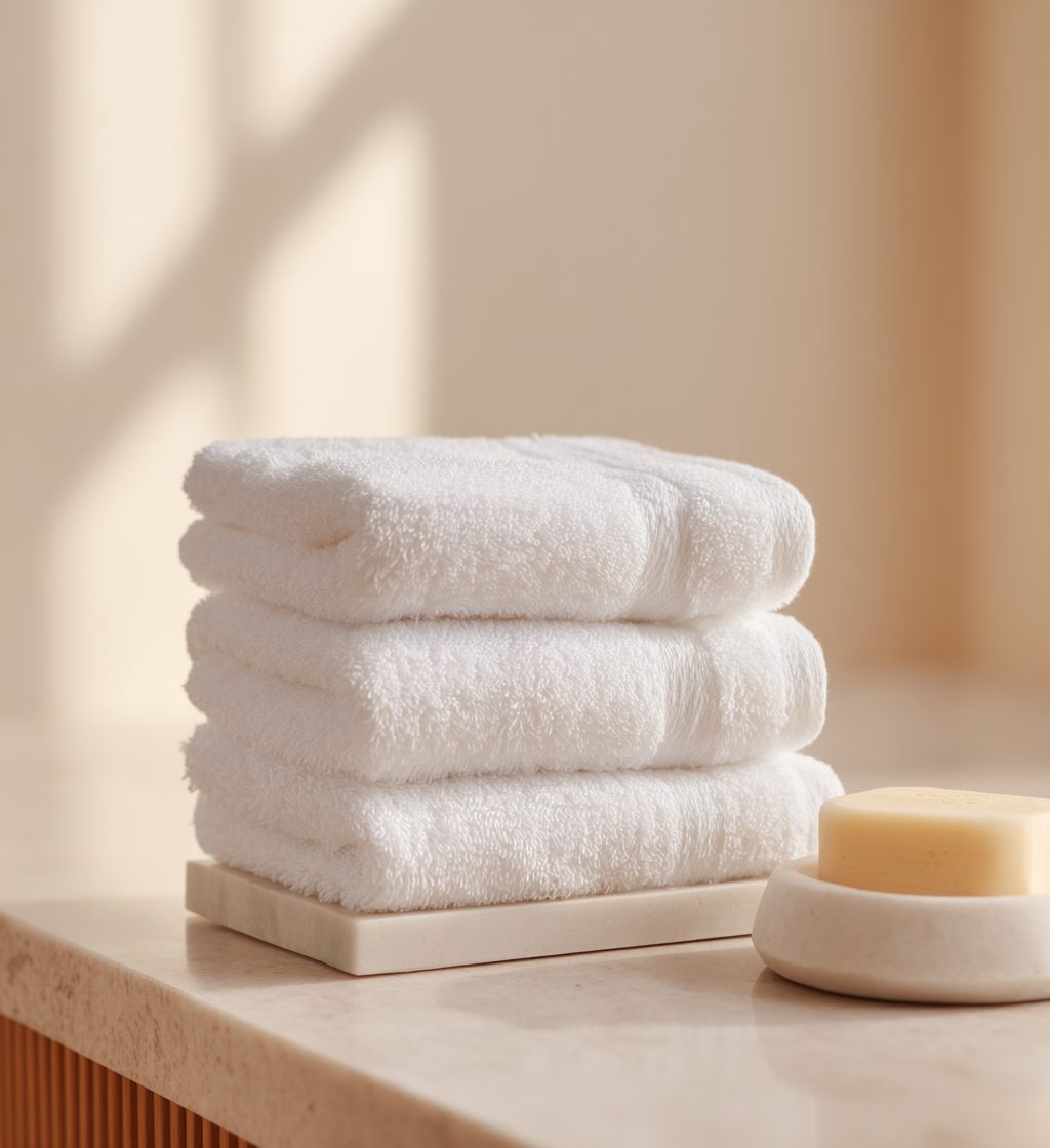
04 · Product in place · folded and stacked4:5 · min 1200×1500px
05 · The room · morning3:2 · min 1800×1200px
06 · The room · evening glow3:2 · min 1800×1200px
In use
Full bleed, in its tilePhotography fills its frame edge to edge, butted to neighbors on the 2px seam.
Never behind textA photograph is never a background. Text sits on its own solid band. No scrims, no protection gradients.
LightWarm, low morning light or cool, dim evening glow. Nothing flat, nothing flashed.
SubjectMaterials as they are found: linen, stone, rooms at rest. Not overly staged, nothing loud.
RatiosLead 3:1, portrait details 4:5, rooms 3:2. Supply images at the listed minimums or larger, in the same proportions.
06 · Plain, calm, certain

Voice & Copy

Short sentences. Common words. No hype, no jargon, no superlatives. Describe the material and let it carry the weight. Never oversell.

The subjectThe product speaks, not the buyer and not the company. Keep it mostly impersonal.
“We”Only for commitments the company makes, as in “We write once a season, at most.”
“You”Only in forms and shipping, as in “Ships in 3–5 business days.” Never “you’ll love”, never “imagine”.
In practice

We Say · We Never Say

We say Woven in small runs, and made to hold its shape. 700 gsm. Combed Aegean cotton. Ships in 3–5 business days from Brooklyn. We write once a season, at most.
We never say Game-changing hotel textiles! Unlock next-level guest experiences 🚀 Elevate. Curate. Innovate. Limited time only. Act now!
Punctuation
THE MIDDOT (·)The brand’s separator wherever a comma is too soft: Brooklyn, New York · Est. 2020; Linen Stone · M; each · case of 12.
QuotesCurly, and only in testimonials.
NeverNo exclamation marks. No ellipses. No em-dash drama. No emojis, anywhere. Ever.
Length
EyebrowsTwo to five words, with no punctuation at the end.
HeadlinesOne line. Two at most.
Section paragraphsOne or two sentences at a 600px measure.
HintsOne short sentence, as in “Partnership accounts are for hotels, spas and residences buying at case quantity.”
07 · When in doubt, add air

Layout & Motion

A centered column at 1280px with wide outer margins. A twelve-column grid that splits into halves, thirds, quarters and sixths. Symmetrical, centered, one focal point per screen.

Twelve columns
Halves
Thirds
Quarters
Sixths
The 2px seam
Tiles and images butt together on a fine 2px seam, for a gallery feel.
The 24px gutter
Product grids take a 24px gutter, where cards need their own edge.
Flat by rule
CornersRadius 0. Nothing is rounded: not buttons, not inputs, not tiles, not badges, not images.
ShadowsNone. No glow, no blur, no glass, no protection gradients. Text that sits on color gets its own solid band.
BordersOne weight: 1px. Claret at 18% on paper; Linen Stone at 24–30% on dark grounds. Never 2px, never dashed.
A cardA Stark White rectangle with a 1px hairline border. There is no elevated card, no floating panel.
BackgroundsFlat single-color fields only. No gradients, no patterns, no textures, no noise.
Section rhythmLinen paper alternates with one full-bleed Claret or Midnight field, with 120–160px of vertical padding. Never more than two background colors in one document.
Recurring devicesExactly two: the 1px hairline rule to mark a pause, and the eyebrow label over a Goldenbook headline.
Quiet

Motion

Color and opacity move; objects do not. No bounces, no springs, no parallax, no reveal-on-scroll. The only transform in the system is a 1px settle on press.

Ink · 140msColor, background and border changes, like hover states and link shifts.
Fades · 240msOpacity moves, like image loads and overlay reveals.
Easingcubic-bezier(0.22, 0.61, 0.36, 1). One curve for everything.
PresstranslateY(1px). No color change, no scale.
Reduced motionTurns all of it off. Durations drop to zero, the settle disappears.
Interface states · try them

Hover, press, tab and click. Nothing scales, lifts, or underlines on hover that wasn’t underlined already.

Solid · hover shifts one tint darker
press settles 1px
Outline · hover fills with an 8% ink wash
A quiet linkLinks & nav · Claret to Toasted Russet
Focus · 1px Claret outline at 3px offset
never removed
Fade · click the square · 240ms
Washes · ink at 8–14%, never new hues
08 · Ready to fill

Social Templates

Three ratios, three treatments each. One idea per post, one mark per post, and never more than two lines of type. Frames here are shown at preview scale. Drop a photo into any slot and it crops to fit.

Photos and mark choices made here are kept, and each template downloads as SVG from the Resources page.

Feed Post · 1:1Canvas 1:1 · 1080×1080px
Woven for Comfort, Built to Last
The Luxe Collection
1a · Claret band · Logo right · Short copy
Robes, Towels, and Linens.
For Those Who Take Luxury Seriously.
Partnership inquiries open
1b · Linen ground · Logo top · Long copy
Quiet Luxury, by the Case.
ORDER NOW AT ESCARRA.COM
1c · Midnight split · Mark corner · Medium copy
Portrait Post · 4:5Canvas 4:5 · 1080×1350px
The turndown, perfected
Luxe Collection Bedding
2a · Claret · Framed object · Short copy

Every Escarra piece is designed in the USA and woven to an exacting standard.

Read the story
2b · Linen · Logo center · Long copy
From our partners
“Our guests ask where our towels are from. Every single week.”
Jonathan Dough · General Manager · Hudson Valley
2c · Russet · Type only · Mark bottom
Story · 9:16Canvas 9:16 · 1080×1920px
New From Escarra:
The Reserve Collection
Swipe up
3a · Linen · Mark top · Photo center
700 gsm.
Combed Aegean cotton.
Shipped from Brooklyn.

Order now at escarra.com
3b · Full bleed · Claret band bottom
Three tiers.
One standard.
Signature · Luxe · Reserve
A cut above the rest

Order now at escarra.com
3c · Midnight · Type only · Photo strip
Rules of the feed
One idea per postOne mark, one photograph, never more than two lines of type.
Canvas sizesFeed 1:1 at 1080×1080px; Portrait 4:5 at 1080×1350px; Story 9:16 at 1080×1920px. Supply photos at canvas resolution or larger, and the slots crop to fit.
Text on its own bandType never sits on a photograph. It takes a solid Claret, Midnight, Russet or Linen field.
GroundsLinen paper or one full-bleed field per post. Approved pairings only, marks at full strength.
VoicePlain, calm, certain. The middot separates; nothing exclaims.
09 · Parts, then screens

Website Design

Every Escarra screen is built from the same parts: core controls, forms, navigation, commerce and content. Each group below is live and shown in both settings — the DTC storefront and the partner portal — and the last group assembles them into the three screens we ship. Everything is interactive. Click it.

GroundsLinen Stone is the working paper. Cards are Stark White on a 1px hairline. One full-bleed Claret or Midnight field carries each section break, and never more than two background colors in a screen.
GeometryRadius 0, shadow none. A 1280px centered column with wide outer margins. Tiles butt on a 2px seam; product grids take a 24px gutter instead.
Type in interfaceGoldenbook for headings and product names only. Quiet Sans carries every label, field, price, table and hint. Buttons and labels are uppercase and tracked; body and product names stay sentence case.
Motion and statesColor and opacity move, objects do not. 140ms for ink, 240ms for fades. Press settles 1px. Focus is a 1px Claret outline at 3px offset, never removed.
Group 01 · Core

Controls, links, status

The smallest parts. Everything else is built on top of these, so their tone must match the ground they sit on.

ButtonSolid Claret is the one primary action on a screen; outline is the secondary. On Claret and Midnight grounds switch to the Linen tone. 48px tall by default, 38px for compact rows, never below 44px for a primary touch target. Out-of-stock tiles keep the outline button and swap the label to Notify Me, which becomes On the List once pressed.
Text linkUnderlined at 5px offset. The label variant, uppercase at 0.18em, is the standing tertiary action. The inline variant inherits body type inside a paragraph. Links move Claret to Toasted Russet on hover.
BadgeOne status marker per tile, in the badge row above the product name. The three tiers have fixed tones — Signature in Russet, Luxe in Claret, Reserve in Midnight — and the situational badges are Partners Only and Out of Stock. Outline by default; solid only when a single badge must be loudest. On dark grounds every badge switches to Linen. Never an icon, never two lines.
Corner tagsNew and Back In Stock are solid corner tags, not badges: Stark White on Claret for the storefront, Stark White on Midnight for the portal. They pin to the top left of a product photograph and never appear inline in body copy.
Eyebrow and hairlineThe two recurring devices. An eyebrow opens a section above the headline; a hairline marks a pause and separates two surfaces that sit close in value. Rules are 1px, Claret at 18% on paper, Linen at 24 to 30% on dark.
Group 02 · Forms

Fields, forms and quantity

Fields, steppers and buttons only appear in the four situations below — a signup, an application, or a single tile being ordered on either surface. They are never mixed on one card.

Newsletter signupStorefront only. A name and an email, the submit welded to the email's right edge, one sentence of hint. It sits on Stark White inside a Linen section and never on a photograph. Two fields is the limit.
Partnership formPortal only. Midnight ground, dark-tone fields stacked at one width, a full-width Linen button to close. Property, contact name, email, number, scale, then one long-form Notes field — the only multi-line input in the system, matched to the field style and resizable by height alone.
Single tileThe one place a stepper appears: beside the buy action on a tile being ordered. Same geometry on both surfaces — Claret on Stark White for the storefront with retail units, Linen Stone on Midnight for the portal with case units.
Input48px tall, label above in uppercase 10.5px at 0.24em, one quiet hint below. The field sits one step darker than its card so the hairline reads. Pass an action to weld a submit button to the right edge with no seam.
Quantity stepperMinus, value, plus inside one hairline box, matched to button height so the two share a line. It appears beside a buy action or in a cart row, never beside a text field. The − and + are typographic, not icons.
Copy in formsThis is the one place the brand says you: "Ships in 3 to 5 business days." Hints are one short sentence. No exclamation marks, no reassurance the material has not earned.
Group 03 · Navigation

Headers and footer

Two headers, one footer. The storefront is symmetrical and calm; the portal is asymmetric and dense. Click the nav to move the underline.

Which headerStorefront header for anything a guest or DTC customer sees. Portal header for signed-in partner work. Never mix them in one product.
Marks in chromeThe primary lockup sits centered in the storefront header and steps down to the wordmark below 120px. The portal takes the wordmark hard left. Both take their ink from the ground, and the mark is never redrawn.
FooterClaret, shared by both products. Lockup and one plain sentence left, up to three link columns right, a hairline, then the colophon: Escarra Hospitality · Brooklyn, New York · Est. 2020. The blurb is a sentence, never a slogan.
Group 04 · Commerce

Tiles and cart lines

Two tile styles, one component. Switch sets below: the storefront runs Claret on Stark White with retail units, the portal runs Linen Stone on Midnight Navy with case units. Add a tile and watch the cart.

Product tileImage at 1:1.1, product name in Goldenbook sentence case, price in Quiet Sans SemiBold with a quiet unit beside it. The action pins to the bottom so a row of tiles keeps one baseline. Four to a row at 1280px, two on tablet.
Two tile stylesDTC tiles are Claret on Stark White with a hairline border: the public, quiet setting. Partner tiles are Linen Stone on Midnight Navy, so a signed-in catalog reads as a working tool at a glance. Same component, same geometry, only the ground changes.
One dark tileOn the storefront a Midnight tile may break a long grid, one per row at most — a pacing device, not a promotion. In the portal every tile is Midnight, and the grid stays uniform.
Corner tagNew and Back In Stock sit in the top left corner of the photograph, flush to the hairline, never in the badge row. Stark White on Claret in the storefront, Stark White on Midnight in the portal. One corner tag per tile.
Which surfaceMost lines run on both surfaces and change only their unit: retail on the storefront, case quantity in the portal. A line held back for partners takes the Partners Only badge and never appears in a public grid.
Out of stockA tile is never hidden or greyed. It keeps its photograph and price, takes the Out of Stock badge, and its action becomes Notify Me. Two words, no countdown, no waitlist copy.
Cart line56×64 thumbnail, name in Goldenbook, options on the middot, small stepper, line total right. The storefront cart and the portal draft order are separate baskets with their own lines and thresholds; the row itself does not change. Options read Linen Stone · M, not "Color: Linen Stone, Size: M".
Tax and shippingTax runs at 8% and sits above the total with estimated shipping beneath it. Shipping is a flat $48.00 and reads Free from $300.00 on the storefront and $2,000.00 in the portal. Both are stated plainly — no "you saved", no progress bar to free shipping.
PricesAlways with the unit that makes them true: each and pair on the storefront, per case of 150, 200 or 1000 in the portal. Never a struck-through price, never a countdown.
Group 05 · Content

Openers, heroes, quotes

The blocks that carry a page's rhythm. Switch the photo side and the quote field to see the approved variations.

Section openerEyebrow, a Goldenbook headline in caps at 0.16em, one paragraph at a 600px measure. Two paragraphs at the very most: this opens the section, it is not the section.
HeroesSplit hero for a product story, centered hero for a pause or a page break. The split headline is the one heading in sentence case, at a tight 0.04em. One action per hero.
Photography in blocksFull bleed inside its half, butted with no gap. A photograph is never a background behind text; where copy meets color it takes its own solid band.
TestimonialOne full-bleed Russet, Claret or Midnight field. Curly quotes, two sentences at most, attribution as name · role · property, city.
Group 06 · Whole screens

The Three Screens

The same parts, assembled. Switch screens below; each one is live, so the storefront nav, the portal's five screens, the tier filter, the steppers and add-to-cart all work.

DTC storefrontHome, collection, product, cart, account and journal. Linen paper, symmetrical, one focal point per screen, 96 to 140px of air between sections. Product grids take the 24px gutter; editorial grids take the 2px seam.
Product pagePhotograph one half, a Stark White copy panel the other, butted with no seam. Badges, name, body at a 440px measure, price with its unit, size chips, stepper welded to the button, then the spec table on hairlines at an 860px measure.
Partner portalOverview, Catalog, Orders, Current Order, Invoices. Midnight page heads on a Linen working ground. Tables are rows of Stark White panels on a 2px seam, never zebra stripes, and the summary panel inverts to Midnight so the total is the one dark object on the page.
Wholesale copyPartner prices always carry their case unit: per case of 150, per case of 200, per case of 1000. Nothing is discounted or struck through. Status is a Badge only, Russet for anything needing attention and Midnight for settled.
ResponsiveThe column holds to 1280px and the grid steps 4 to 2 to 1. The storefront header collapses to a menu icon with a 34px lockup. Nothing reflows into a new visual language on the way down. The three screens above are shown at their 1280px design width, scaled to fit the frame.
10 · The catalog set

Product Mockups

One piece, one surface, one light. Product is photographed the same way every time, so a catalog page reads as one set: a single piece on the surface it lives on, lit from one side, centered in a 10:11 frame. The shadow falls to one side and is left where it lands.

The crops below are the approved set, by category. They are the reference for every new session, and a new product joins its category shot the same way.

FrameOne 10:11 portrait frame for every product, supplied at 1600×1760px or larger for print, 1000×1100px for screen. No square crops, no landscape, no cutouts on white.
GroundWhatever surface the piece lives on, kept plain and warm: plaster, linen, stone, tile, teak, carpet, sand. One product in focus per photo, or one size run of the same piece shot together as a set. Props are limited to what already belongs in the setting, and they never take the light off the piece.
LightLow, warm side light indoors. Open daylight for poolside and beach pieces. The shadow stays soft and reads as a second shape. Never flat, never flashed.
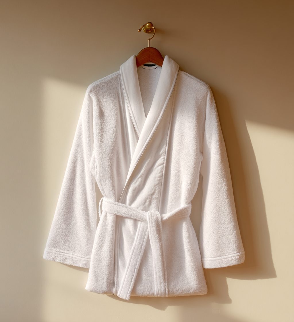
PresentationHowever the piece is actually used: hung, folded, stacked, rolled, laid flat, propped open, or set as a pair on the floor. Hung is the default for anything with a shoulder.
LabelWhere the piece carries a woven mark, the mark is visible and legible at full size. It is never straightened or added later.
RetouchDust and lint go. Weave, hem and pile stay as they are: no smoothing, no added contrast, no color correction beyond white balance.
One sessionA category is shot in one session, on one ground wherever the product allows, so the tiles sit together in a grid without a break.
Current products by category
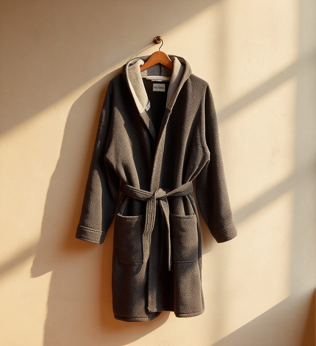
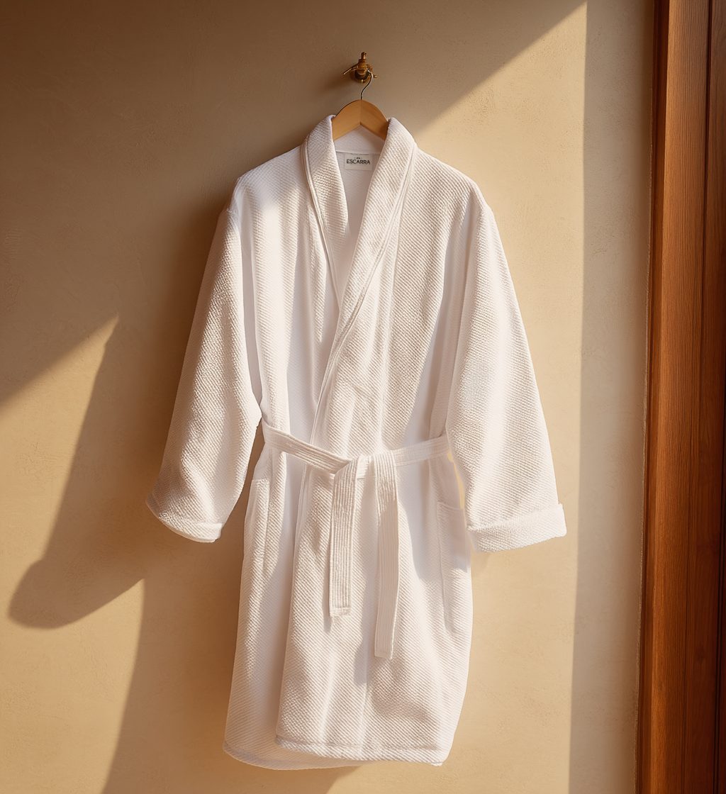
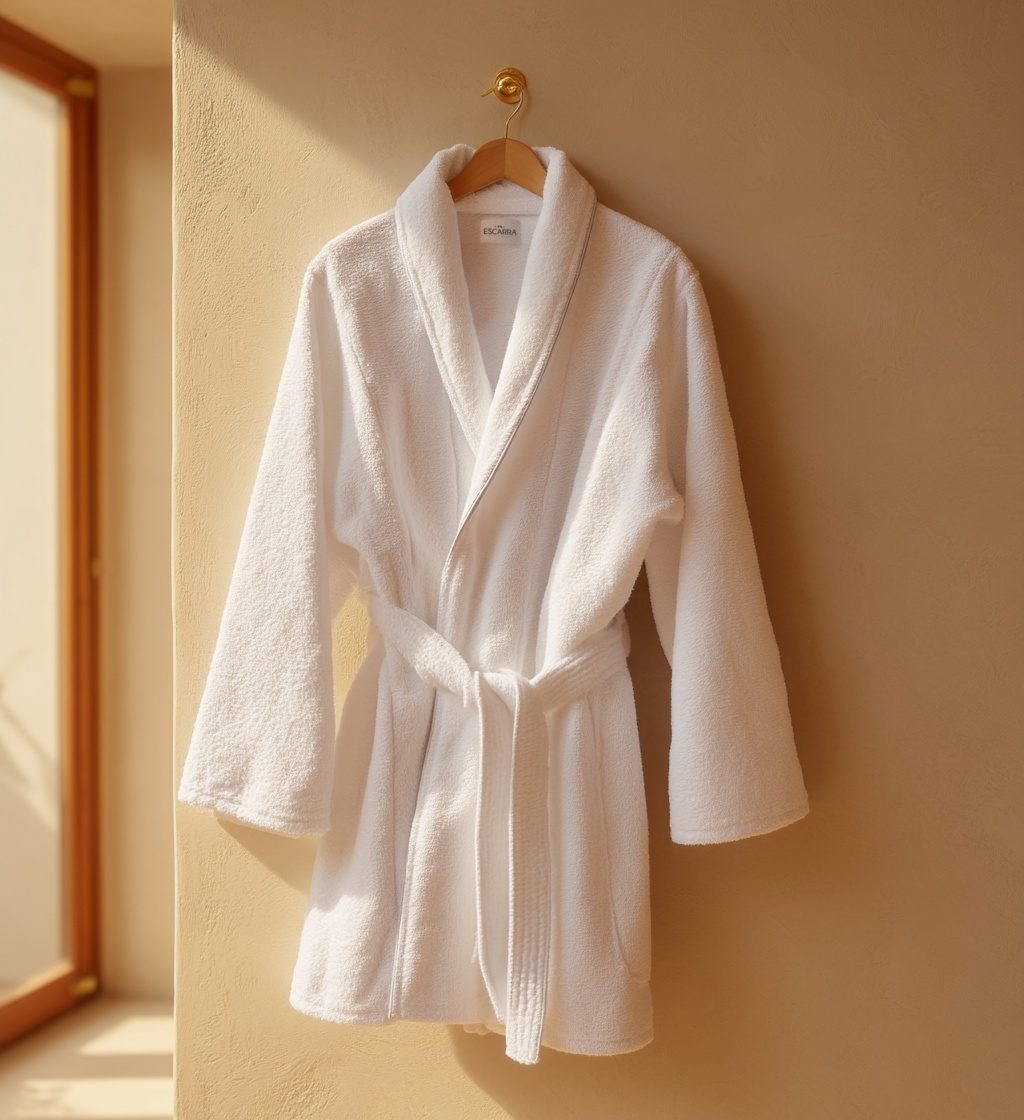
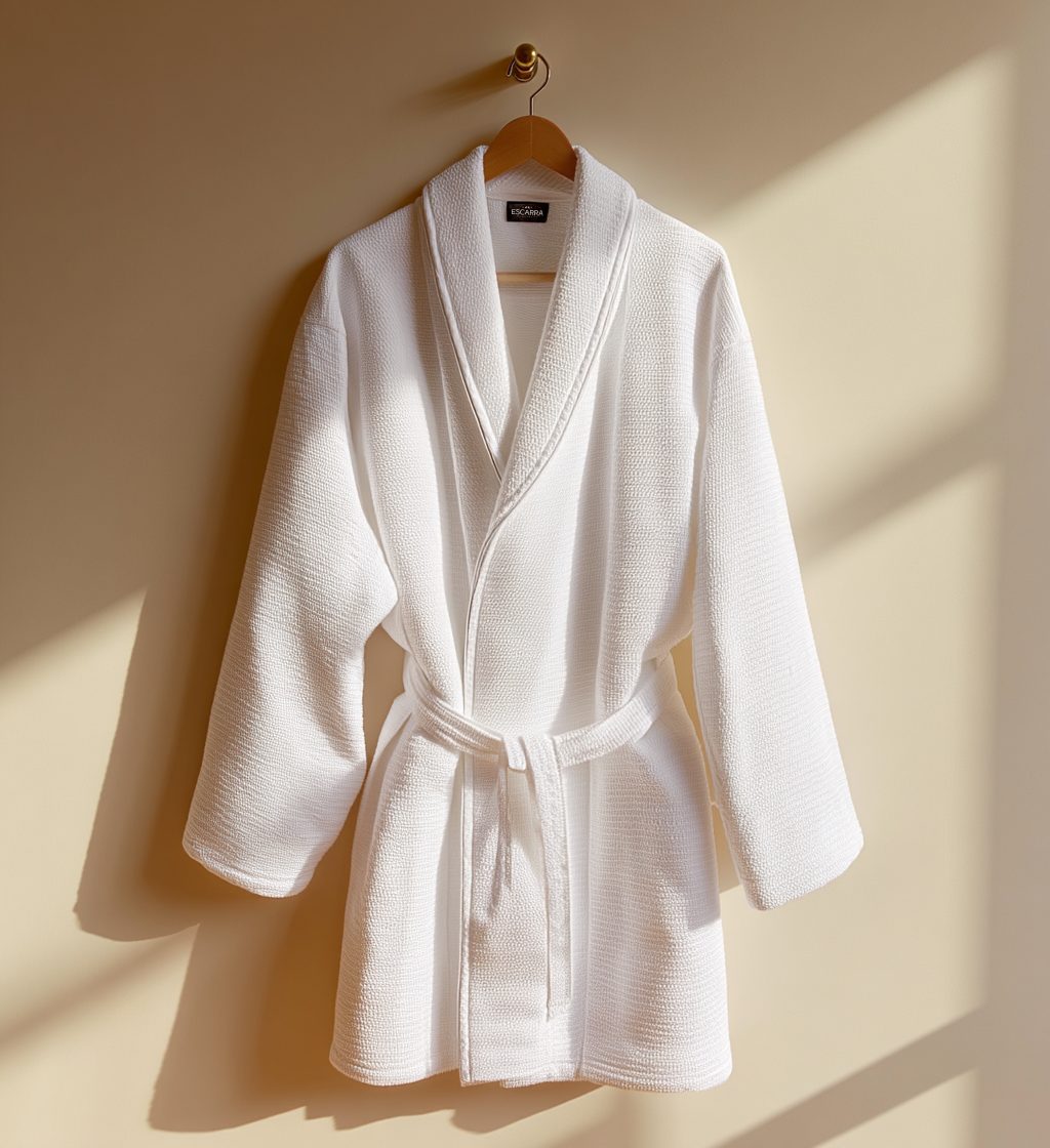
BathrobesSix approved · 10:11 aspect ratio · reference crops

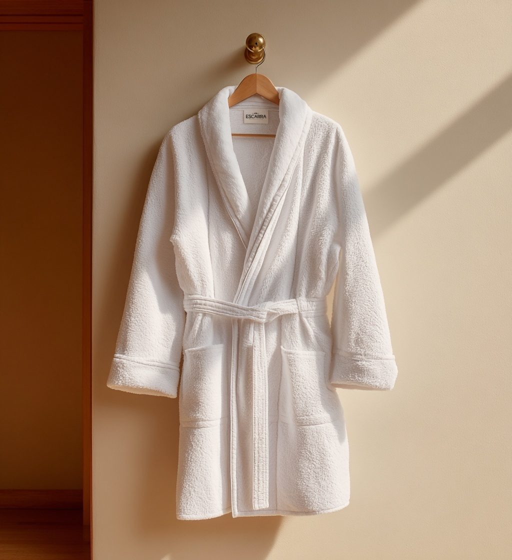
Hung on a wood hanger, belt tied once and left to fall. Shawl or hood as the piece is cut.

Signature Plush Robe
01 · Signature Plush Robe10:11
Boxer's Robe
02 · Boxer's Robe10:11
Deluxe Diamond Robe
03 · Deluxe Diamond Robe10:11
Luxury Terry Robe
04 · Luxury Terry Robe10:11
Premium Waffle Robe
05 · Premium Waffle Robe10:11
Luxury Velour Robe
06 · Luxury Velour Robe10:11
SlippersFive approved · 10:11 · reference crops

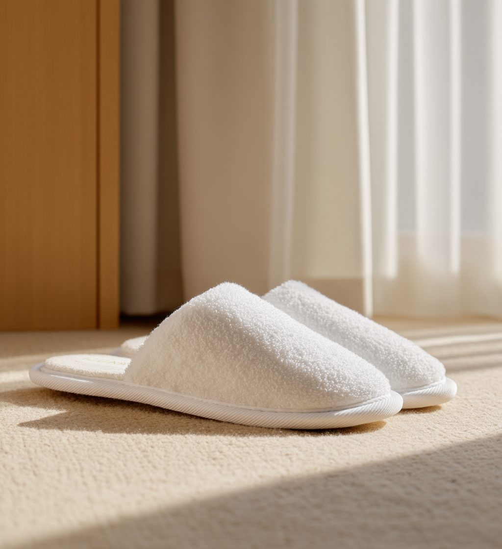
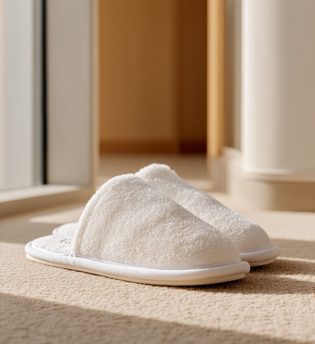
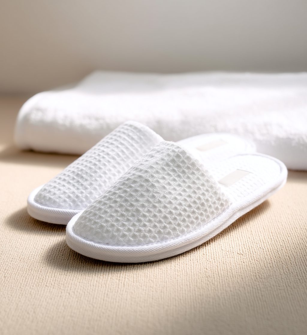
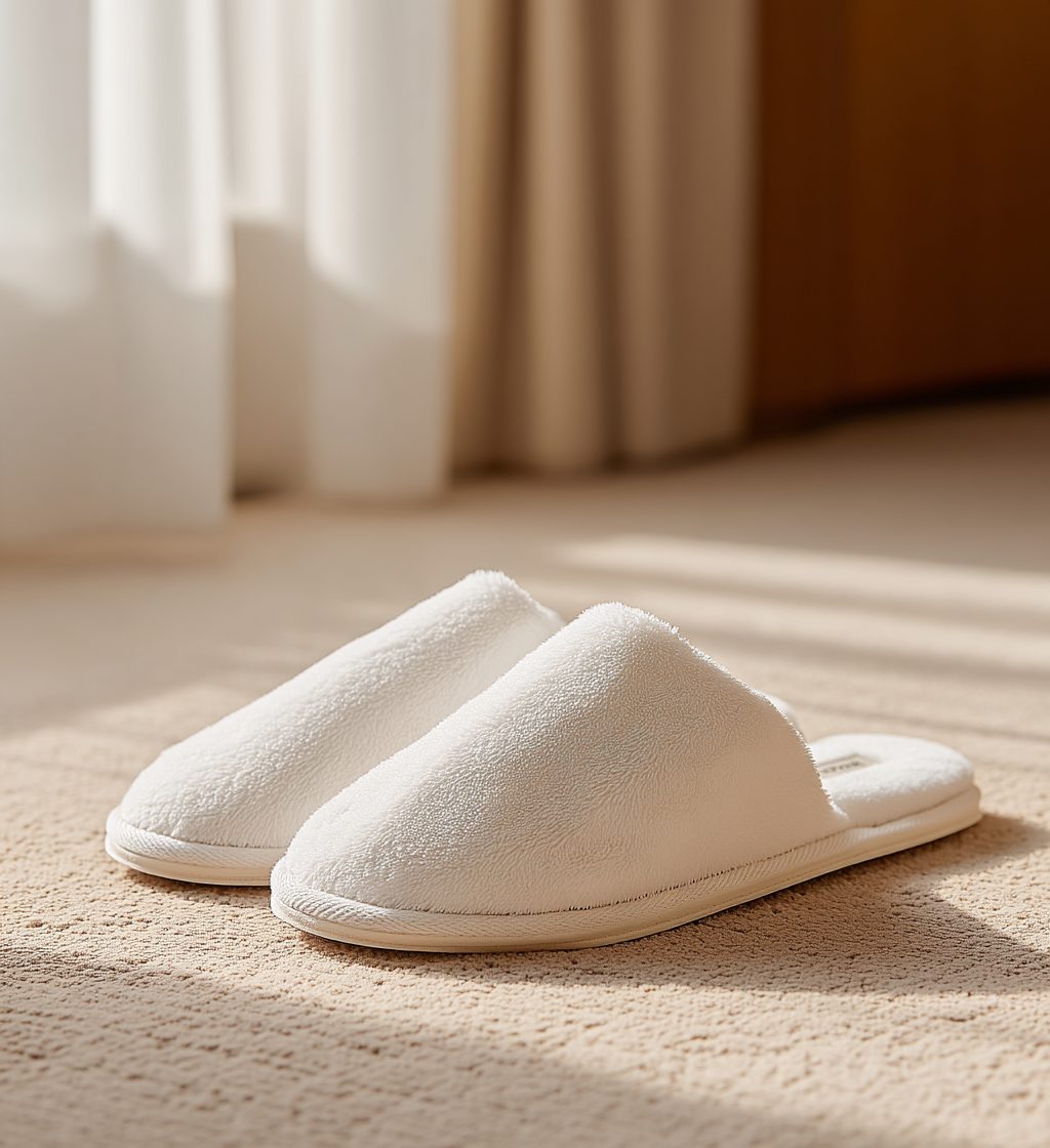
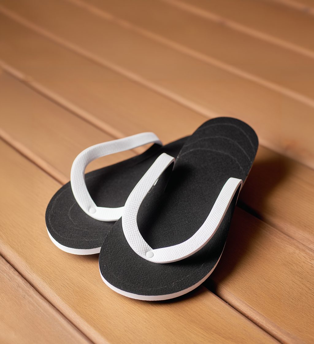
Shot as a pair on the floor they live on, one shoe forward and slightly turned. Low side light across the pile.

Signature Plush Slippers
01 · Signature Plush Slippers10:11
Terry Slippers
02 · Terry Slippers10:11
Waffle Weave Slippers
03 · Waffle Weave Slippers10:11
Plush Rubber Sole Slippers
04 · Plush Rubber Sole Slippers10:11
EVA Spa Slippers
05 · EVA Spa Slippers10:11
Towels & LinensSeven approved · 10:11 aspect ratio · reference crops

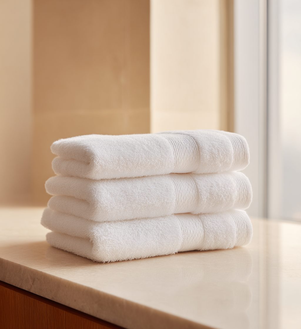
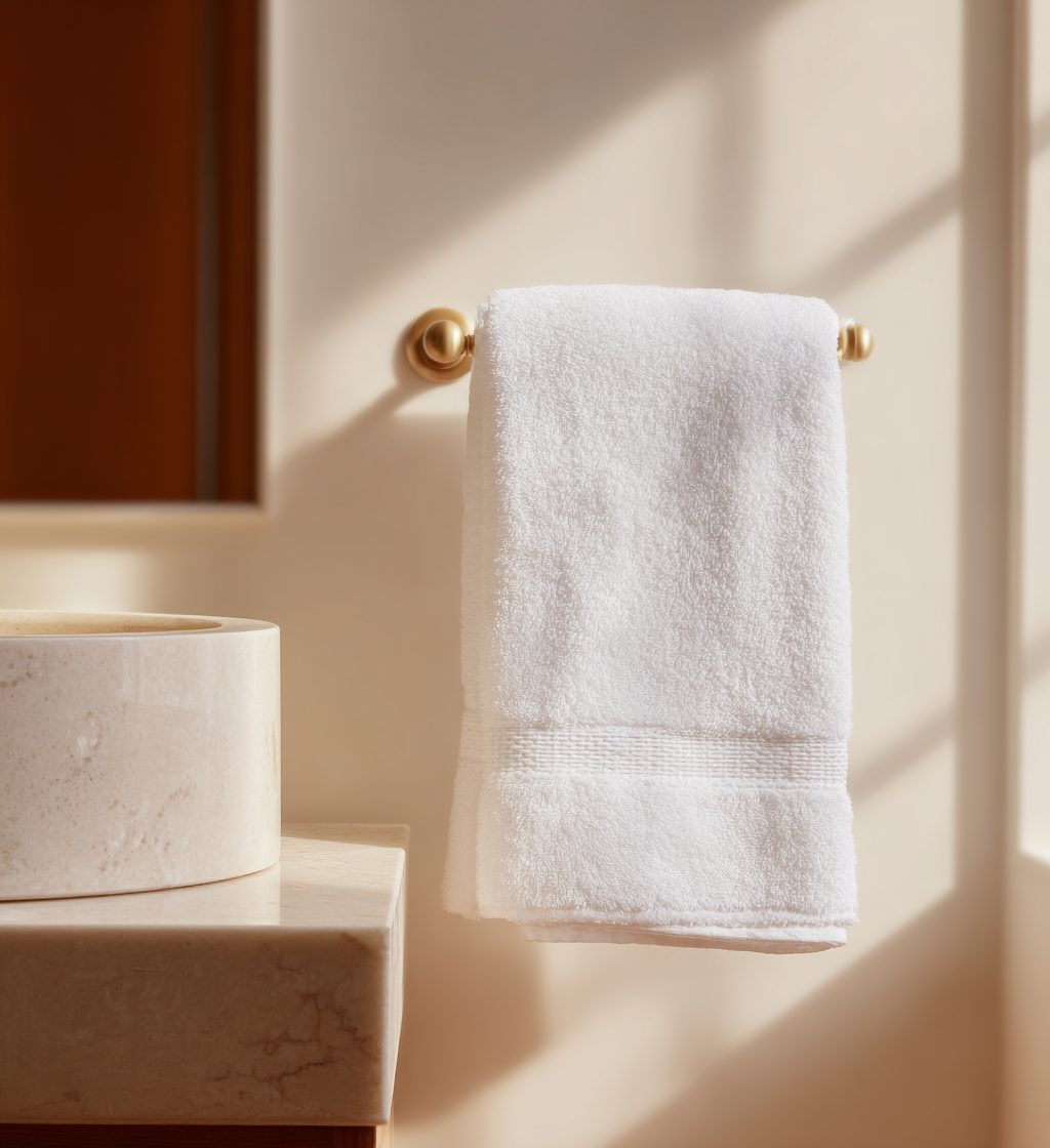
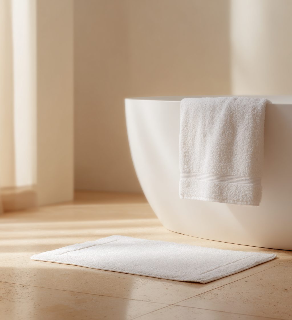
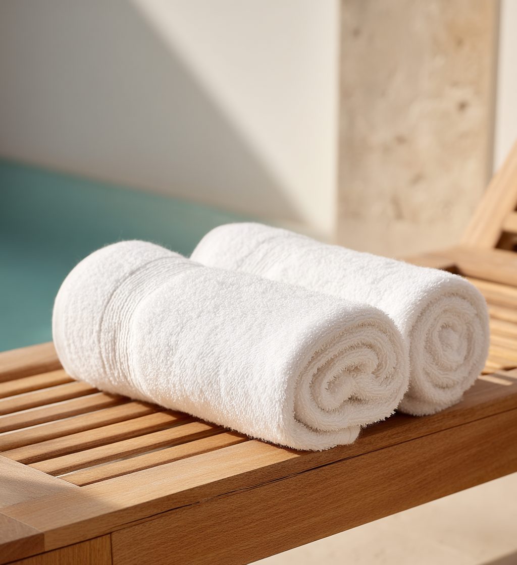
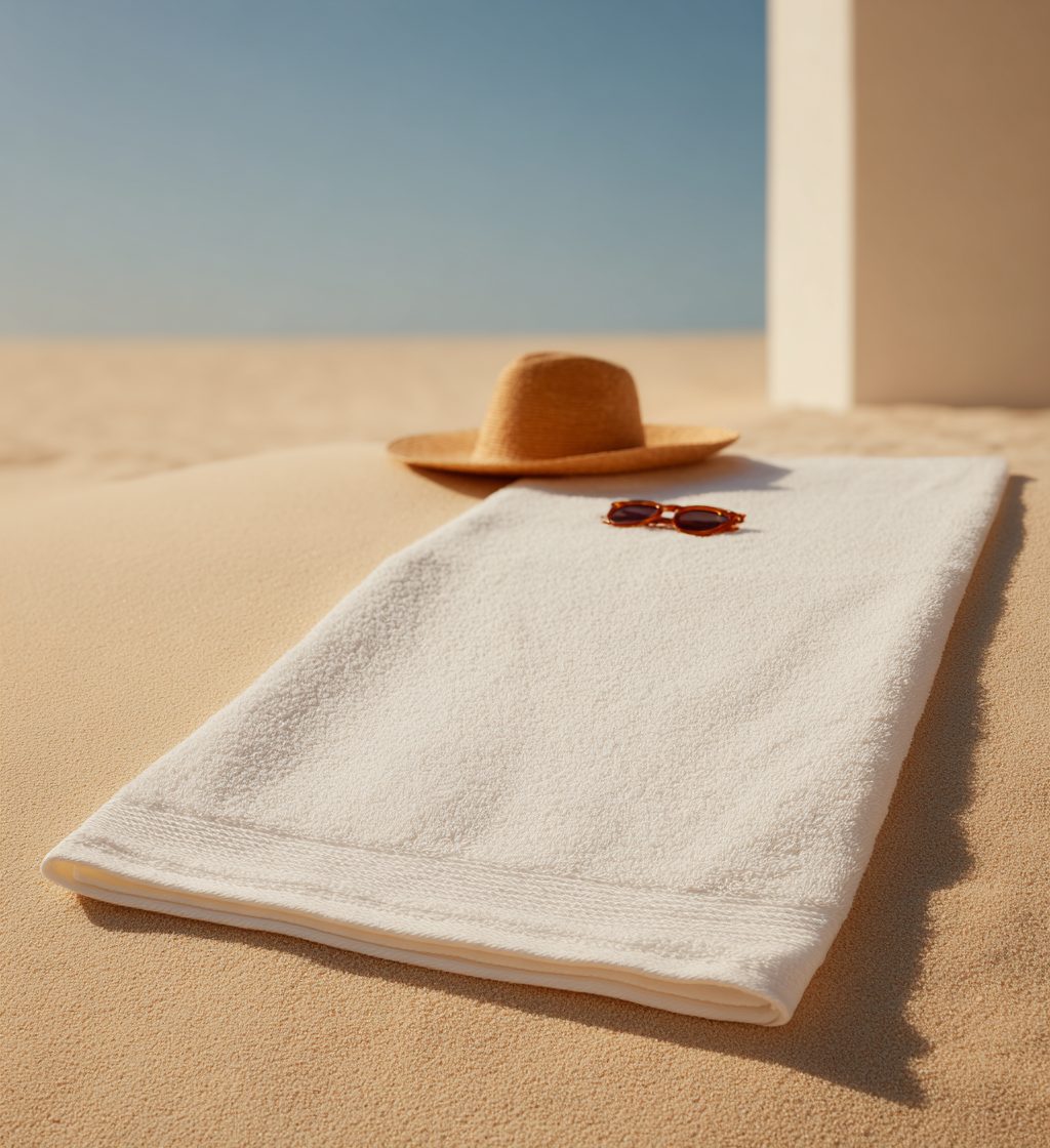
Folded, stacked, rolled, hung or laid flat, on the surface the piece is used on. However it is set, the hem and the pile read. Indoor pieces take low side light; pool and beach pieces are shot outdoors in open daylight, with only what belongs there in the frame.

Bath Towel
01 · Bath Towel10:11
Hand Towel
02 · Hand Towel10:11
Face Towel
03 · Face Towel10:11
Floor Towel
04 · Floor Towel10:11
Pool Towel
05 · Pool Towel10:11
Beach Towel
06 · Beach Towel10:11
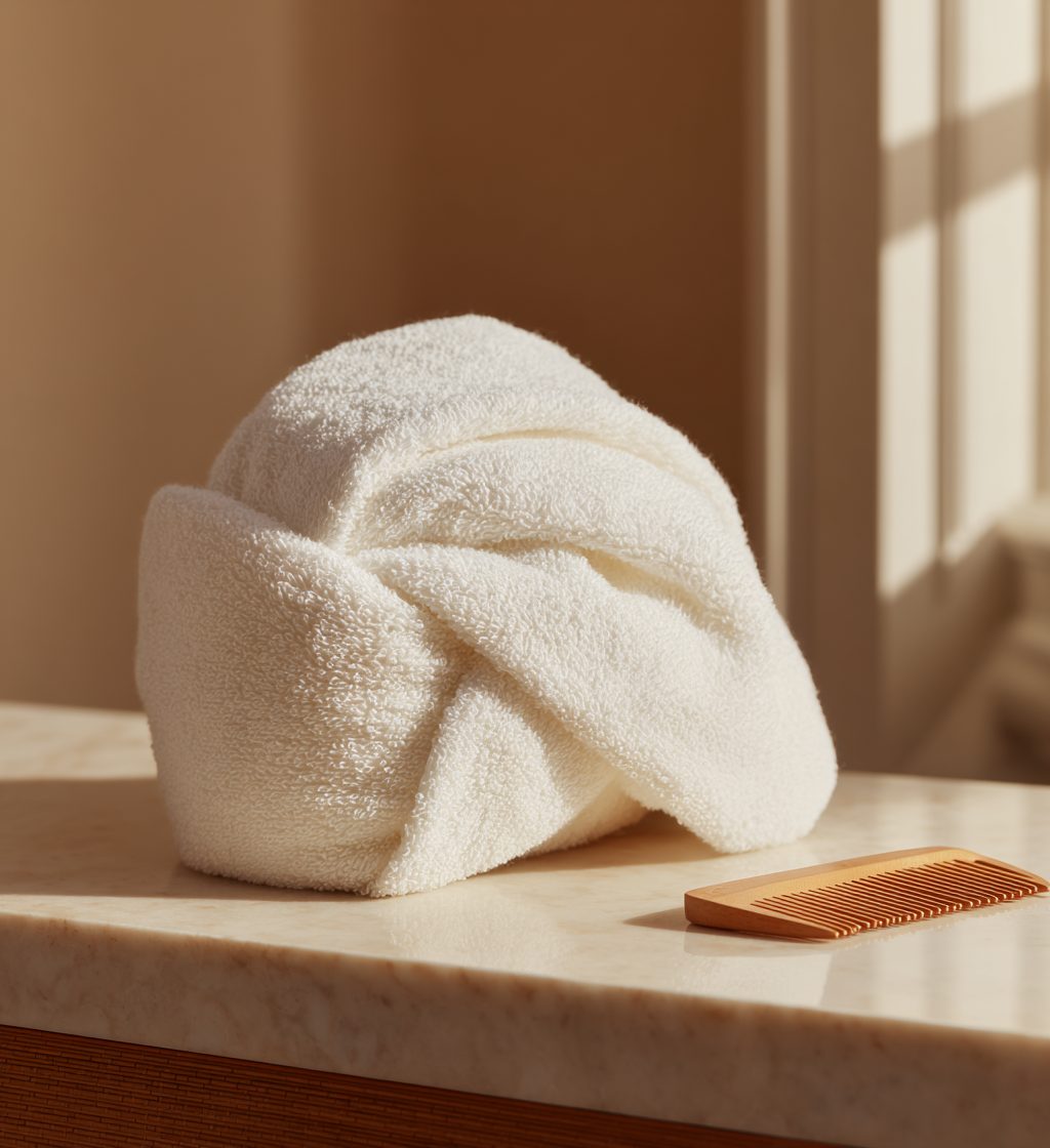
Hair Towel
07 · Hair Towel10:11
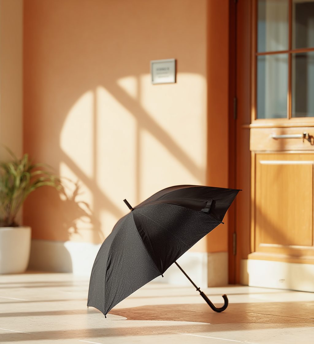
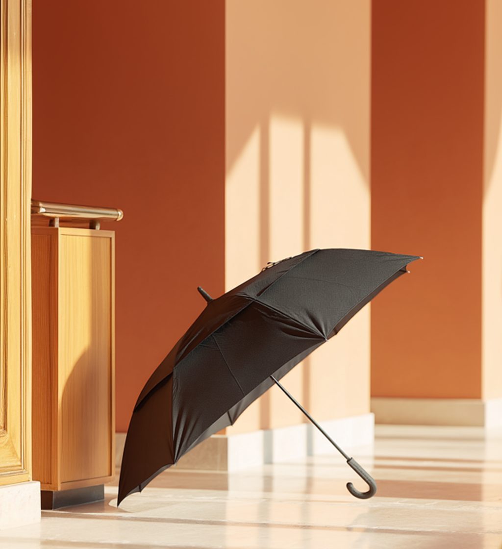
UmbrellasThree approved · 10:11 aspect ratio · reference crops

Propped open on a stone floor or a wood surface, canopy resting on its ribs and the crook handle turned to the light. The entrance behind it stays soft.

Classic Guest Umbrella
01 · Classic Guest Umbrella10:11
Signature Guest Umbrella
02 · Signature Guest Umbrella10:11
Luxury Doorman Umbrella
03 · Luxury Doorman Umbrella10:11
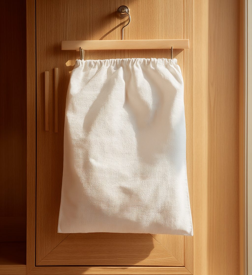
Bags & AccessoriesSix approved · 10:11 · reference crops

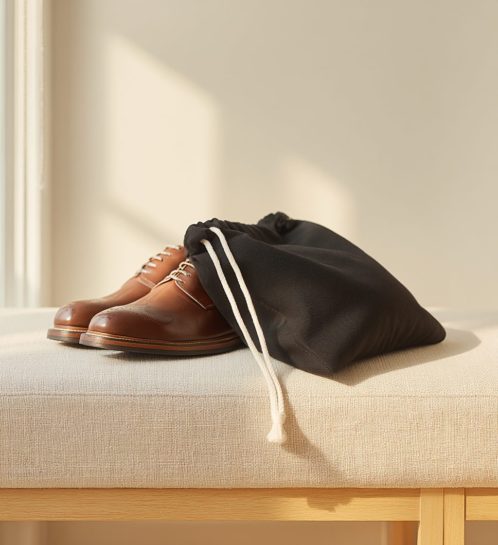
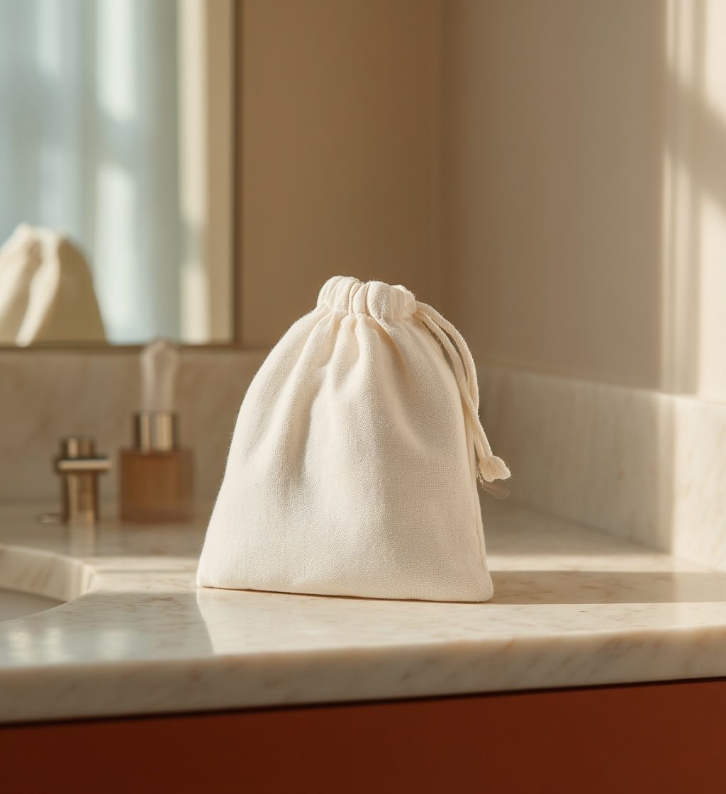
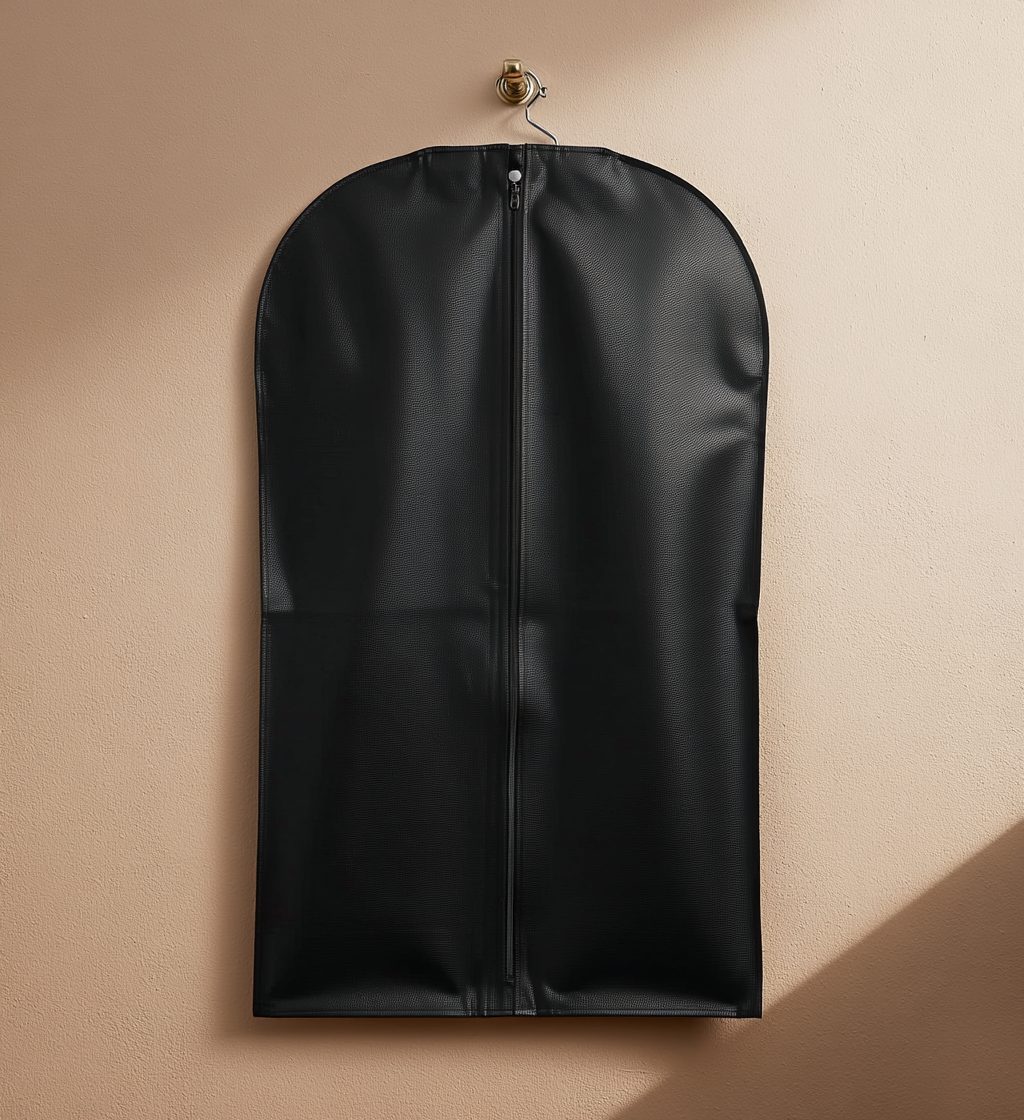
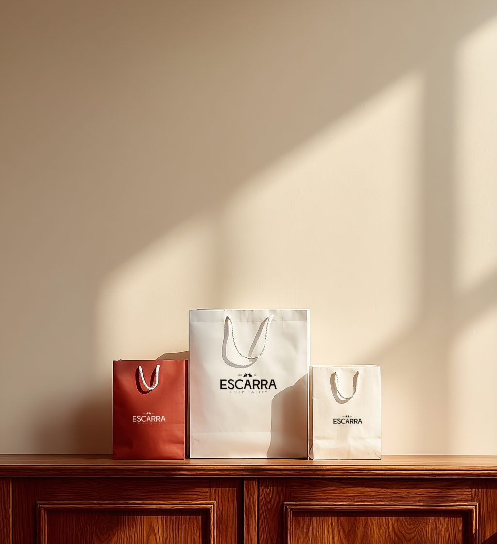
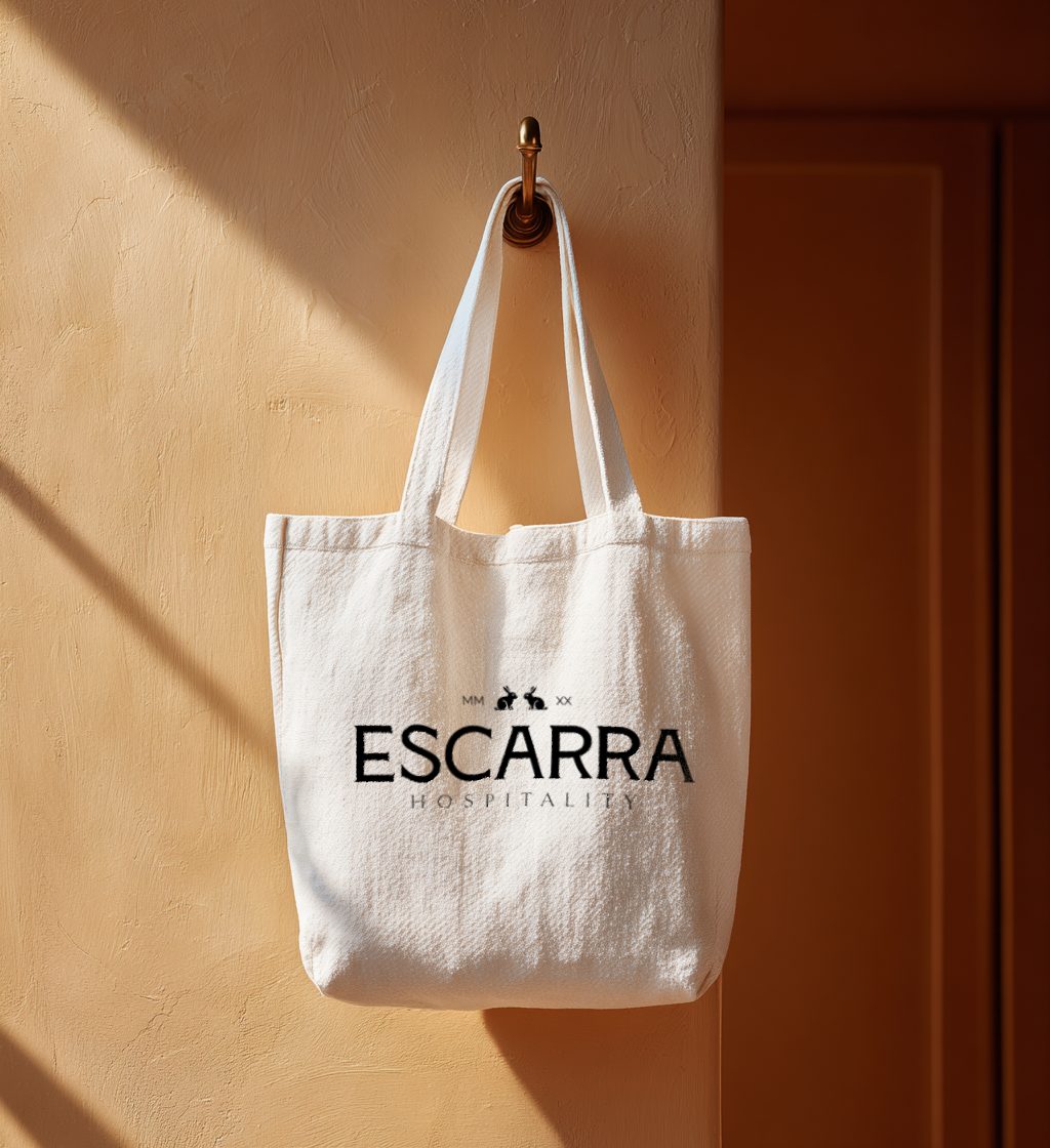
Hung where the piece hangs, or set down on the surface it is kept on. Where the piece carries a printed mark, the mark faces the camera. Where a piece comes in a size run, the run is shot together.

Luxury Laundry Bag
01 · Luxury Laundry Bag10:11
Luxury Shoe Bag
02 · Luxury Shoe Bag10:11
Luxury Hairdryer Bag
03 · Luxury Hairdryer Bag10:11
Non-Woven Garment Bag
04 · Non-Woven Garment Bag10:11
Shopping & Gift Bags
05 · Shopping & Gift Bags10:11
Tote Bag
06 · Tote Bag10:11
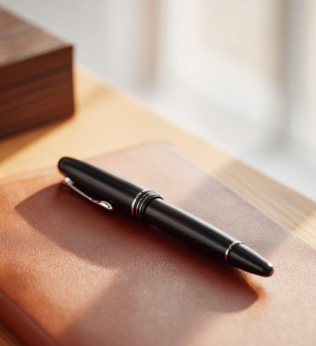
Stationery & OfficeFive approved · 10:11 aspect ratio · reference crops

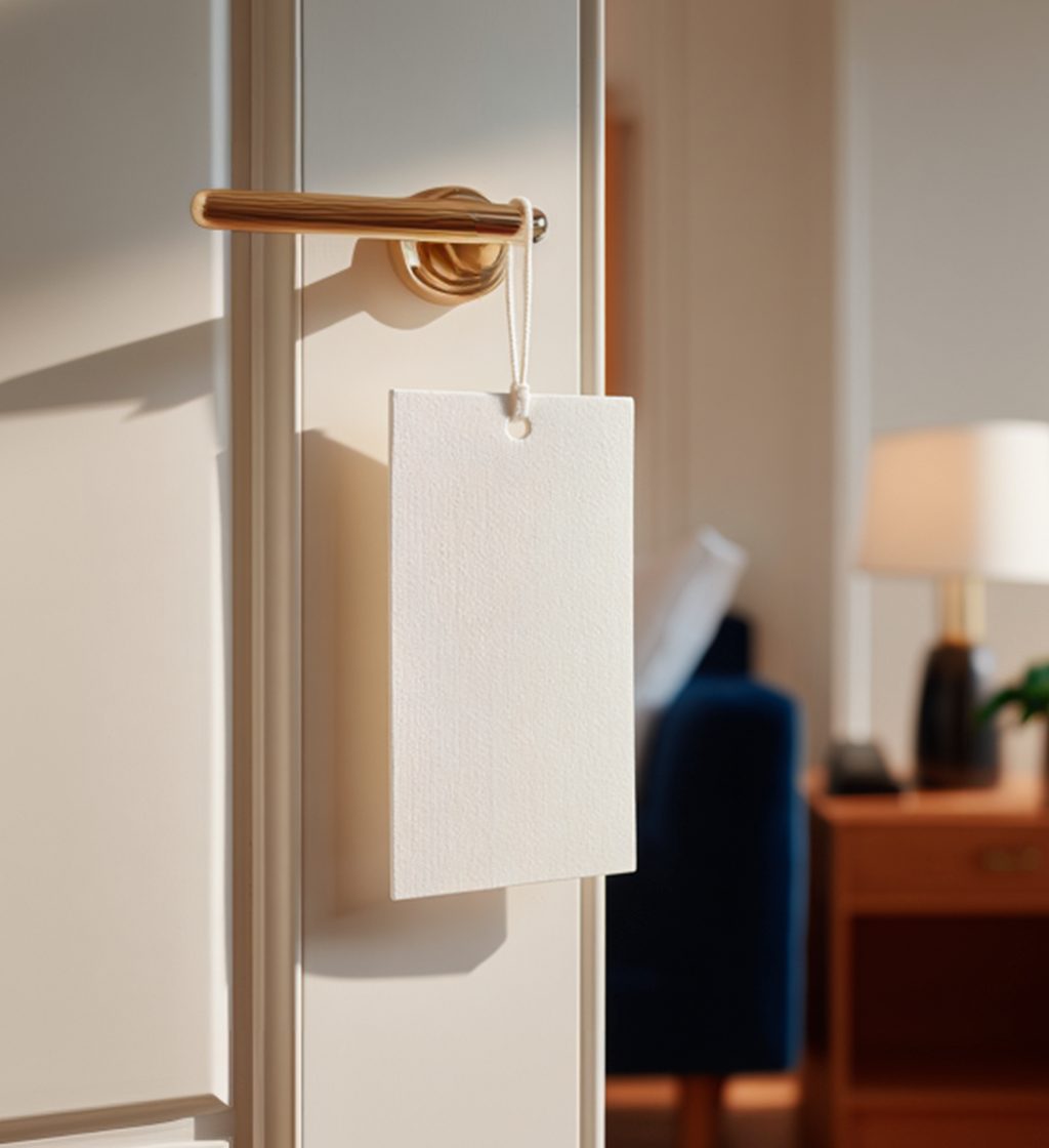
Set down on the desk or counter the piece is used on, or hung where the piece hangs. Turned to the light at a shallow angle so the edge, grain and binding read. The room behind stays soft.

Executive Pen
01 · Executive Pen10:11
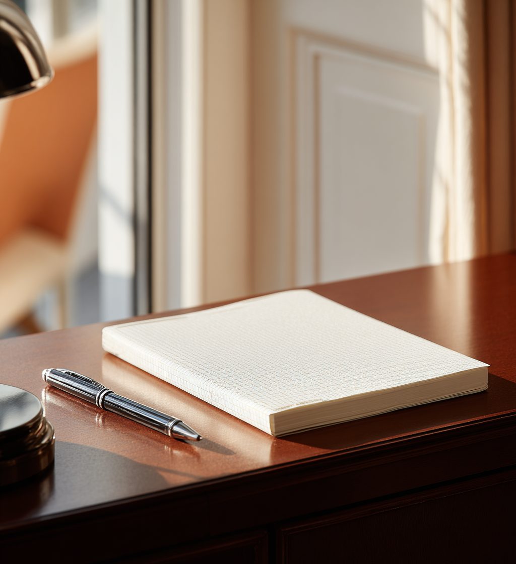
Pad with Binding
02 · Pad with Binding10:11
Leather Folio
03 · Leather Folio10:11
Door Hanger
04 · Door Hanger10:11
Keycard
05 · Keycard10:11
Additional designs

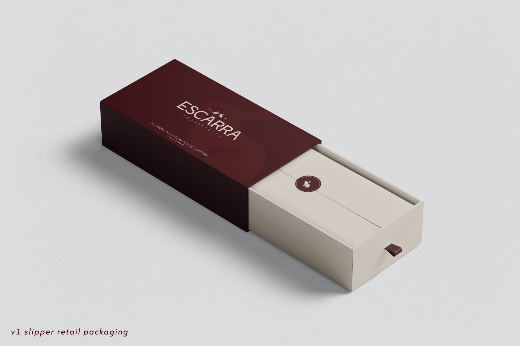
Applications beyond the textile line, shown as v1 mockups: stationery, apparel, promotional pieces and retail packaging. Each is set in the marks and pairings this guide fixes. Artwork files ship from the Resources page.

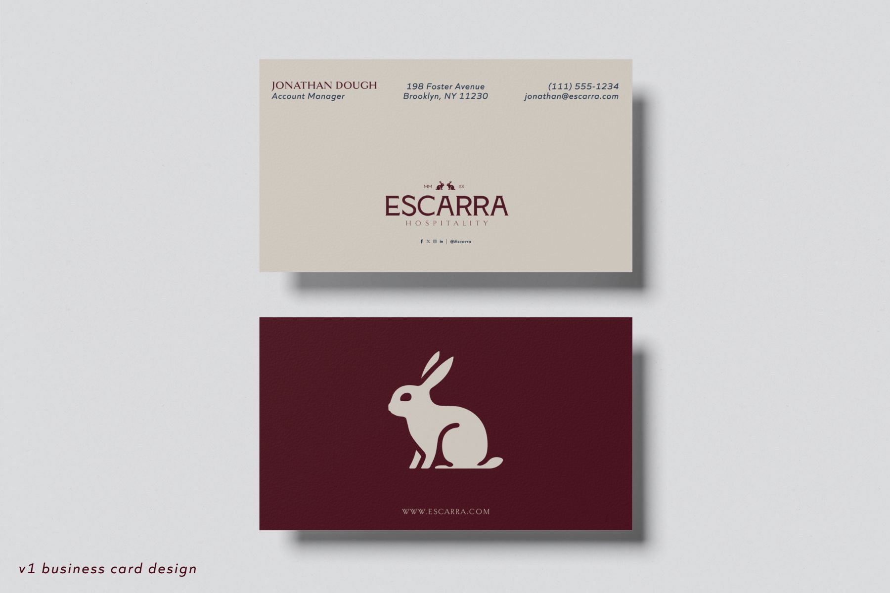
Business Cards
01 · Business Cardsv1 mockup
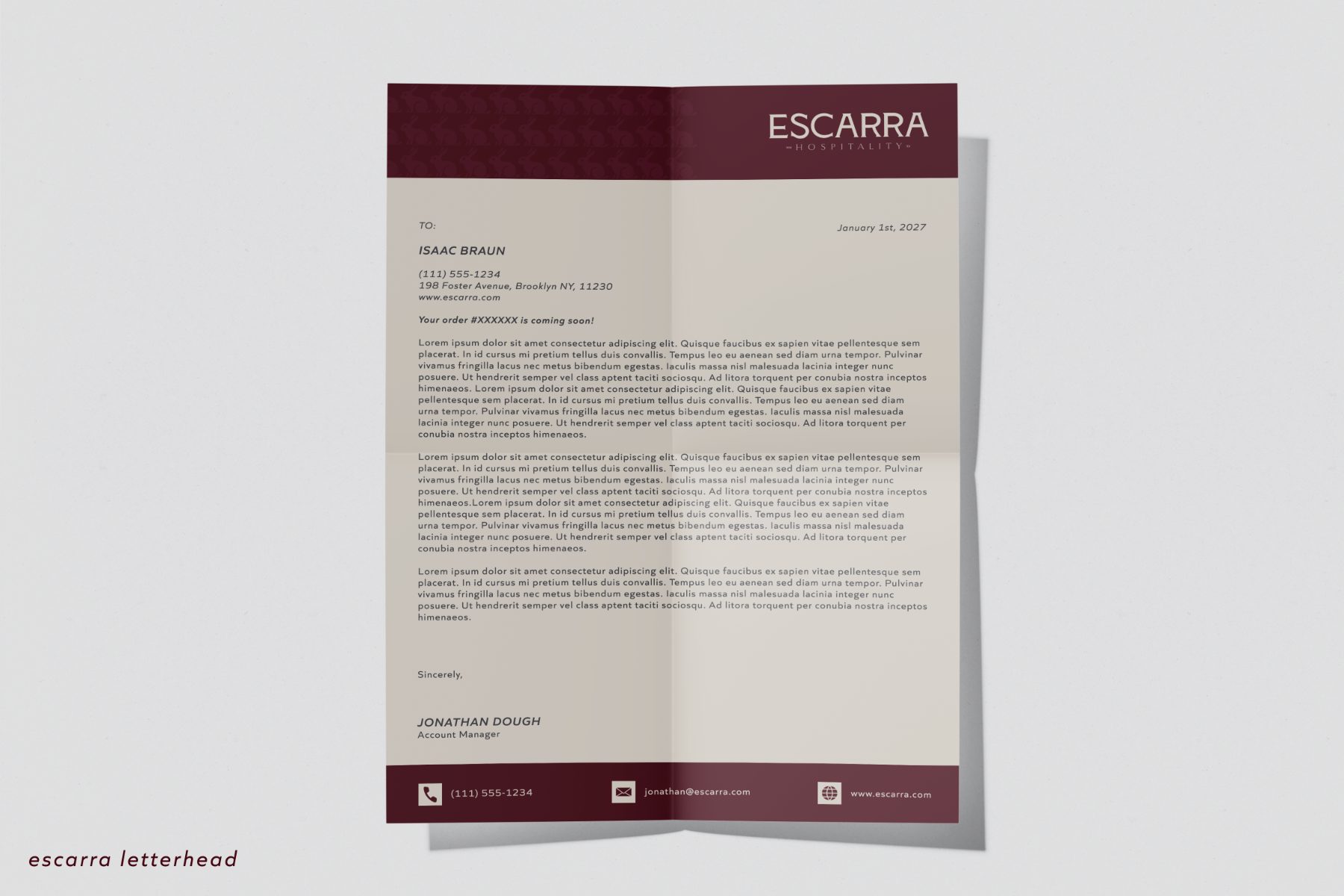
Letterhead
02 · Letterheadv1 mockup
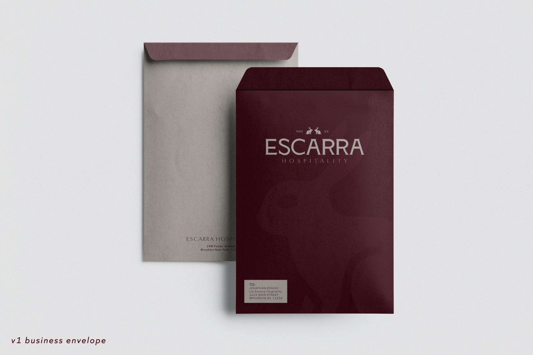
Business Envelope
03 · Business Envelopev1 mockup
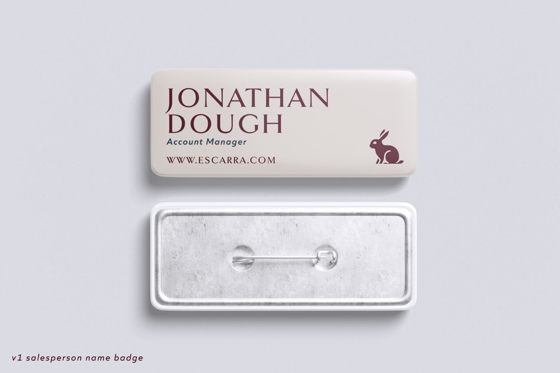
Name Badge
04 · Name Badgev1 mockup
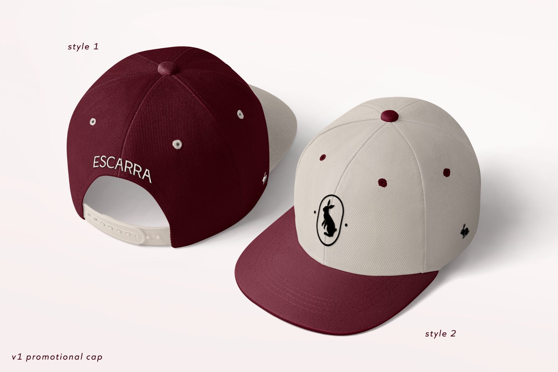
Promotional Cap
05 · Promotional Capv1 mockup
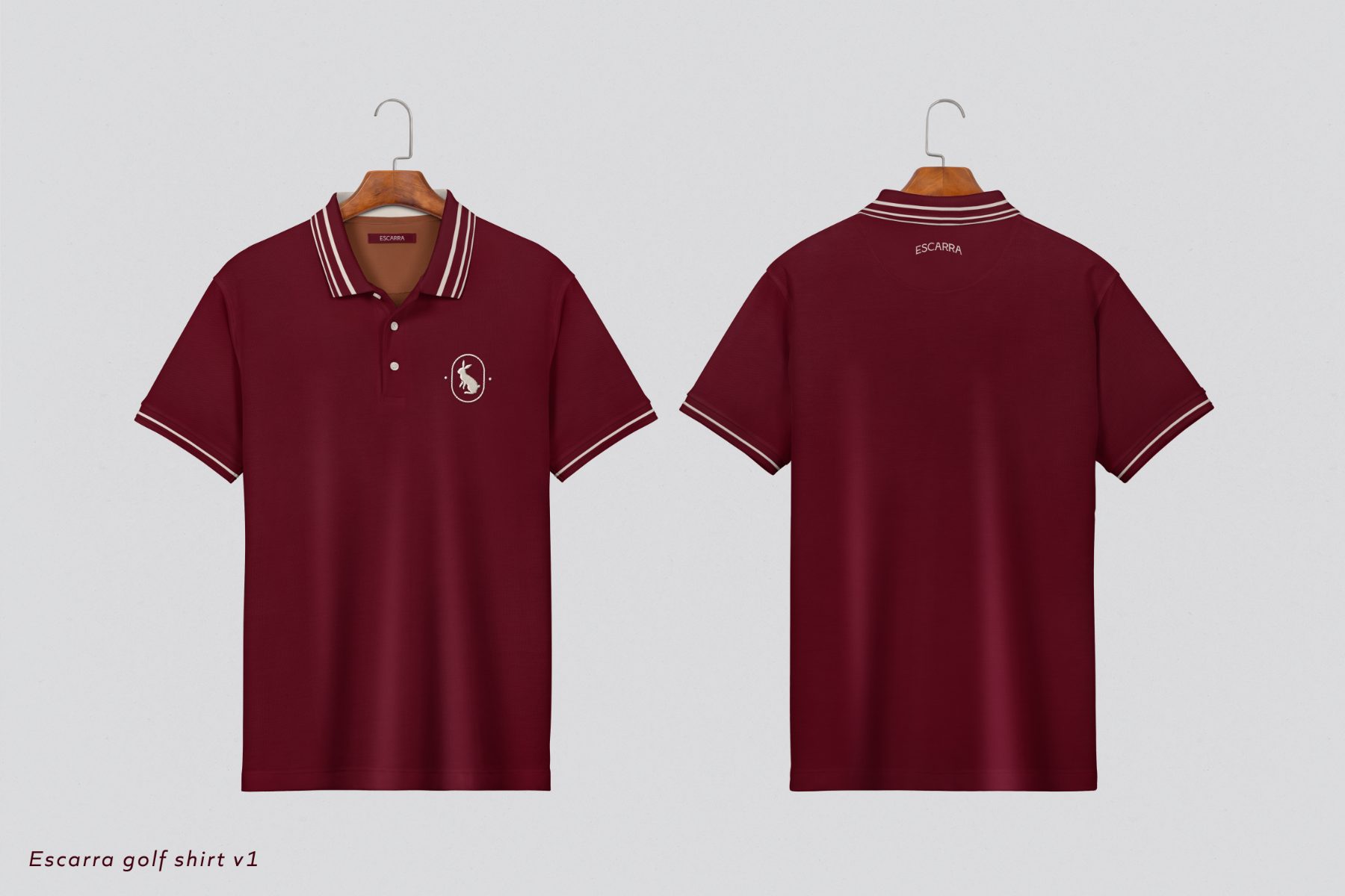
Golf Shirt
06 · Golf Shirtv1 mockup
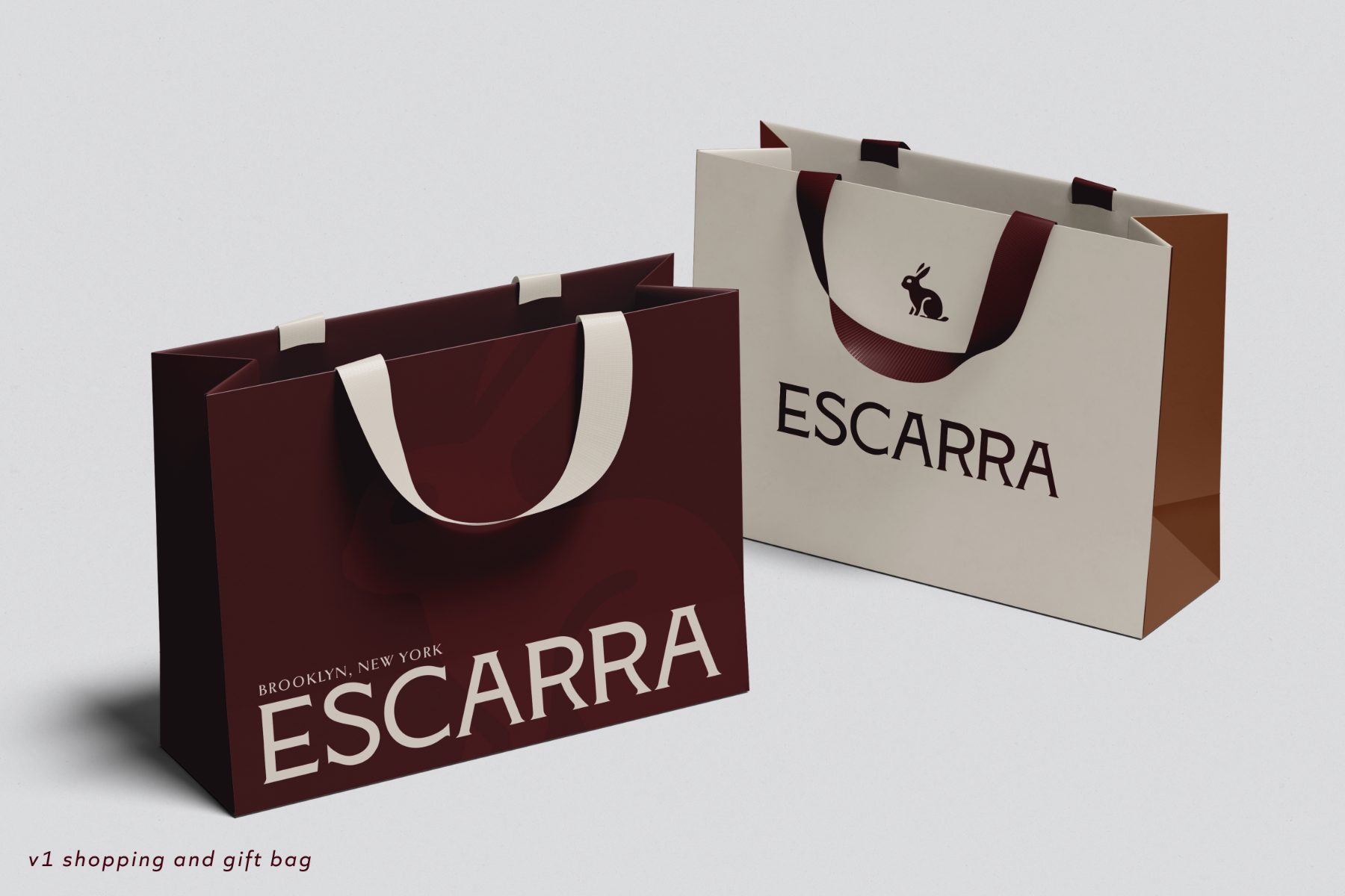
Shopping & Gift Bags
07 · Shopping & Gift Bagsv1 mockup
Slipper Retail Box
08 · Slipper Retail Boxv1 mockup
11 · Every file in hand

Resources

Every file the brand ships, gathered on one page: the marks in any approved pairing, the icon sheet, the social templates, and the typeface licenses. The rest of this guide shows how each is used. This page is where they are taken.

SVG is for screen. EPS is for print. Colors are baked in at full strength.

The marks

Choose a ground. Every mark downloads in the ink that pairing takes — there are four pairings and no others. Minimum sizes are listed beside each mark; usage rules live on the Marks page.

Ground
Claret on Linen Stone
Primary LockupThe default mark. Hare over wordmark, for covers, headers and packaging fronts.Min 120px
Formal LockupThe full setting with subtext, for certificates and formal print.Min 160px
Primary WordmarkType alone, for tight horizontal spaces.Min 64px
Wordmark · Est. YearThe wordmark carrying the founding year, for stationery and hangtags.Min 120px
Hare LargeThe hare alone, for embroidery and large fields.Min 100px
Hare SmallThe simplified hare, for small stampings and woven labels.Min 48px
Monogram BadgeThe everyday product mark.Min 64px
Classic Badge FullReserved for apparel and merchandise. Print only.Min 120px
Classic Badge MiniThe small cut of the classic badge, for tags and trims.Min 48px
FaviconWhite on Claret, fixed — the ground picker does not apply. Browser tab and app icon only.16–32px
The icon set

All twelve icons on one sheet, drawn on a 24px grid at a 1.6 stroke. Choose a ground: the sheet takes Claret on light grounds and Linen Stone on dark. The icons themselves are on the Icons page.

Ground
Claret on Linen Stone
Icon SheetAll twelve icons on one sheet, in the ink the chosen ground takes.12 icons
Social templates

The nine layouts from the Social page, exported as placed there: a photo dropped into a template and the mark chosen for it ride into these files. Each downloads as SVG, embedding the photograph and carrying frame, marks and type as vector. Templates carry their own fixed grounds, so no ground is chosen here.

1a · Feed PostClaret band · Logo right · Short copy.1080×1080px
1b · Feed PostLinen ground · Logo top · Long copy.1080×1080px
1c · Feed PostMidnight split · Mark corner · Medium copy.1080×1080px
2a · Portrait PostClaret · Framed object · Short copy.1080×1350px
2b · Portrait PostLinen · Logo center · Long copy.1080×1350px
2c · Portrait PostRusset · Type only · Mark bottom.1080×1350px
3a · StoryLinen · Mark top · Photo center.1080×1920px
3b · StoryFull bleed · Claret band bottom.1080×1920px
3c · StoryMidnight · Type only · Photo strip.1080×1920px
The typefaces

Both families are licensed through Adobe Fonts, not downloaded from here. Activate them on the license that covers the work.

Ground
Claret on Linen Stone
The weight your guests rememberGoldenbook over Quiet Sans
GoldenbookDisplay and headings, always Regular. Fallback is Marcellus.Adobe Fonts
Quiet SansSubheads, body, labels and everything small. Fallback is Jost.Adobe Fonts